


Project Info
Project Description
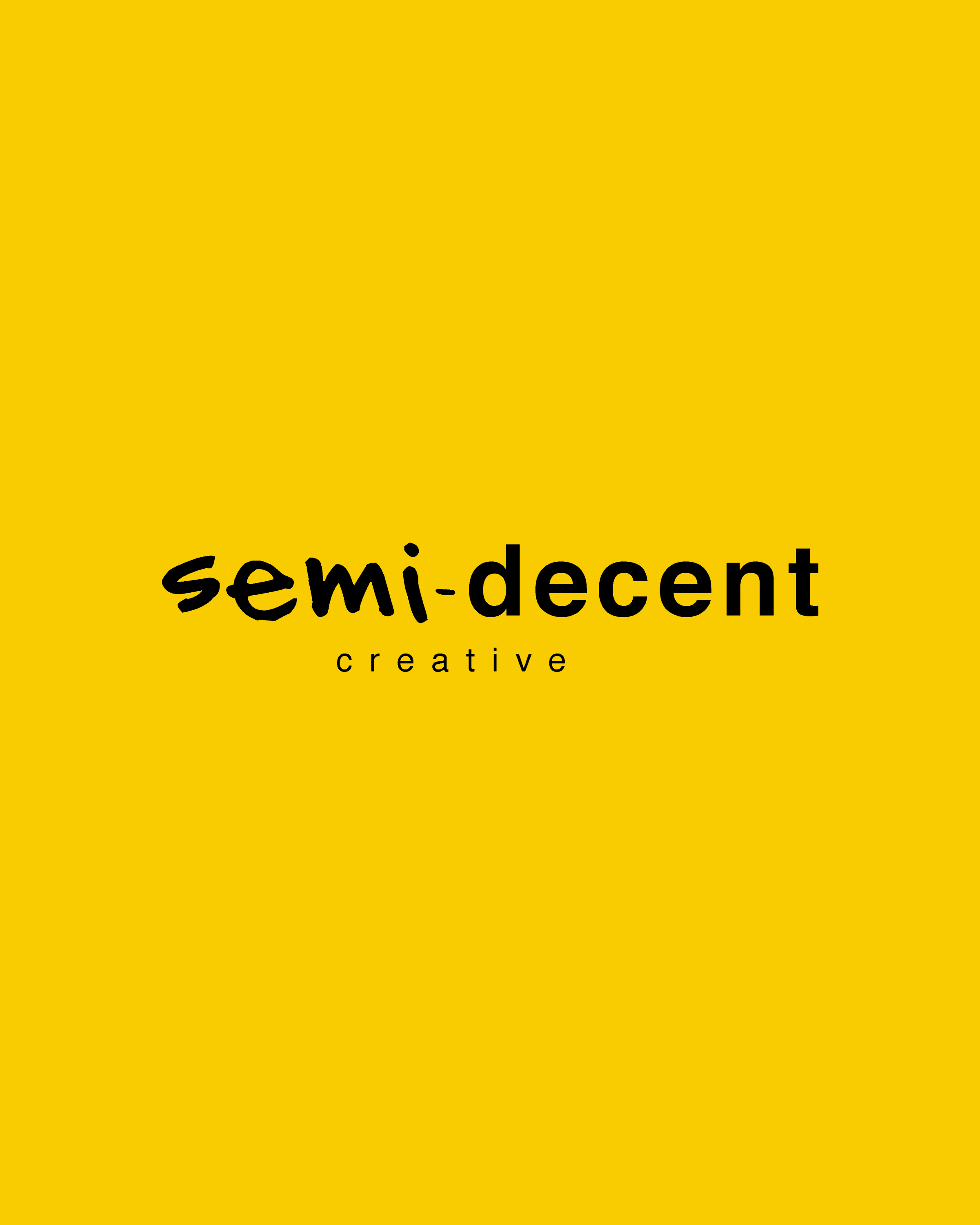
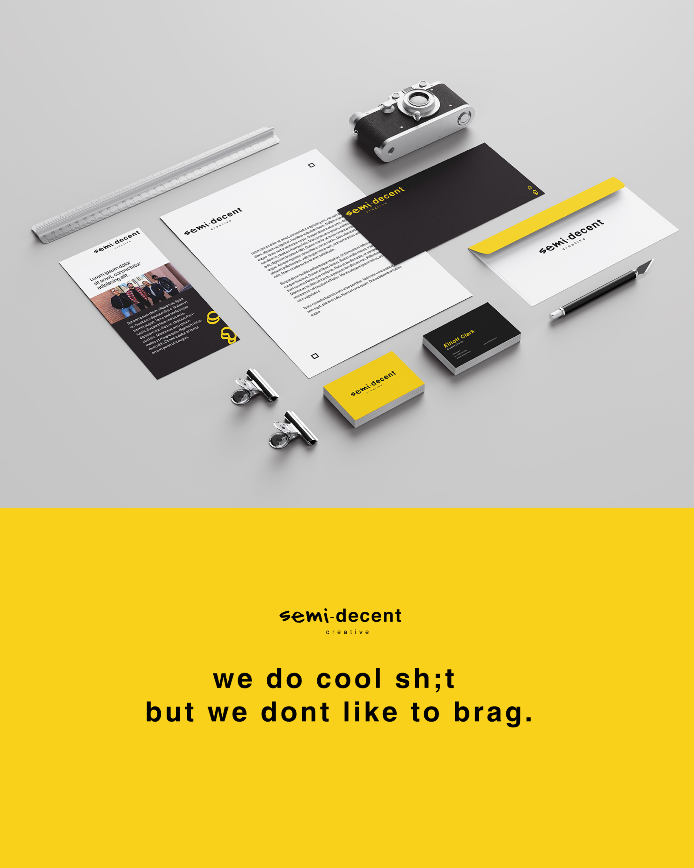
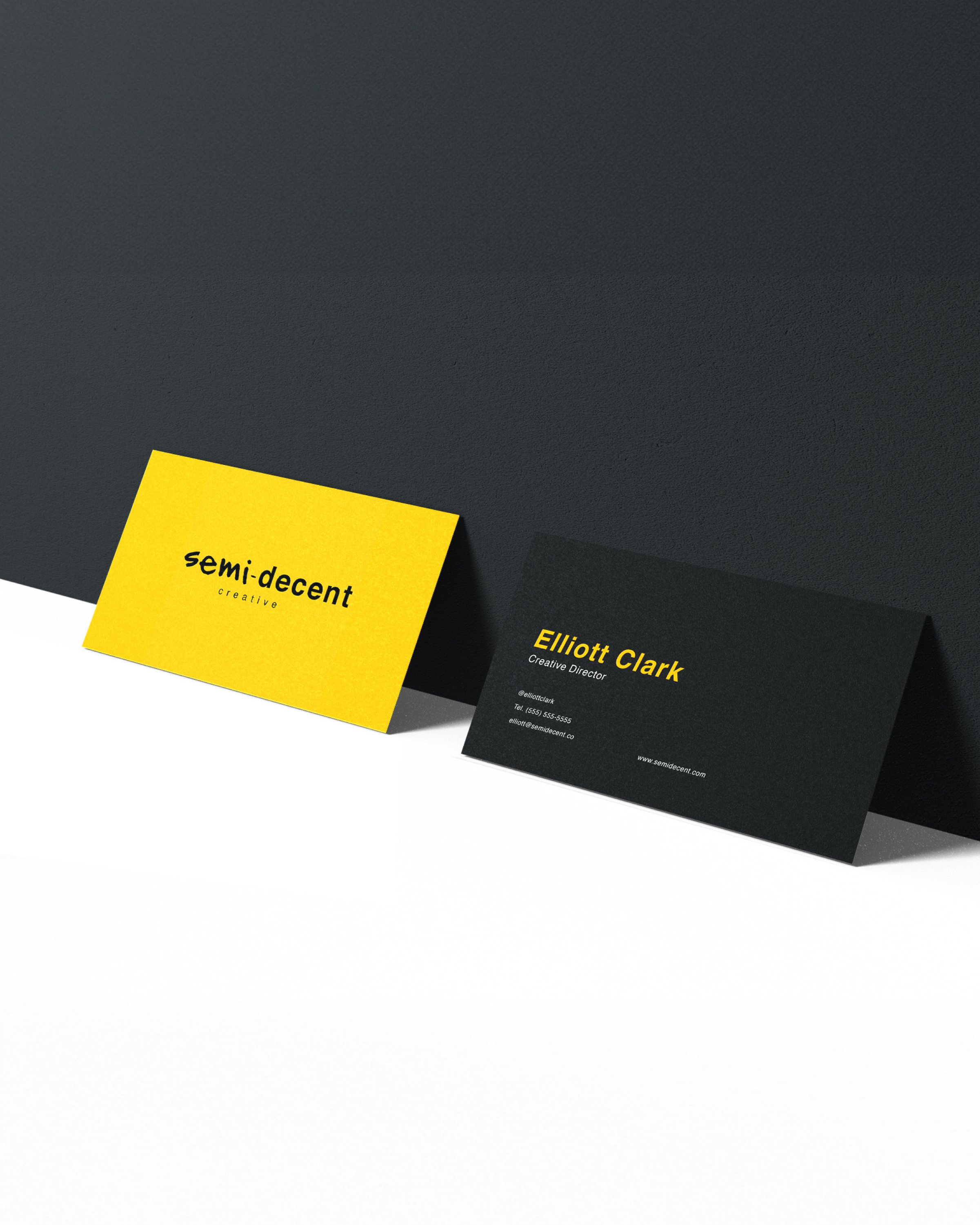
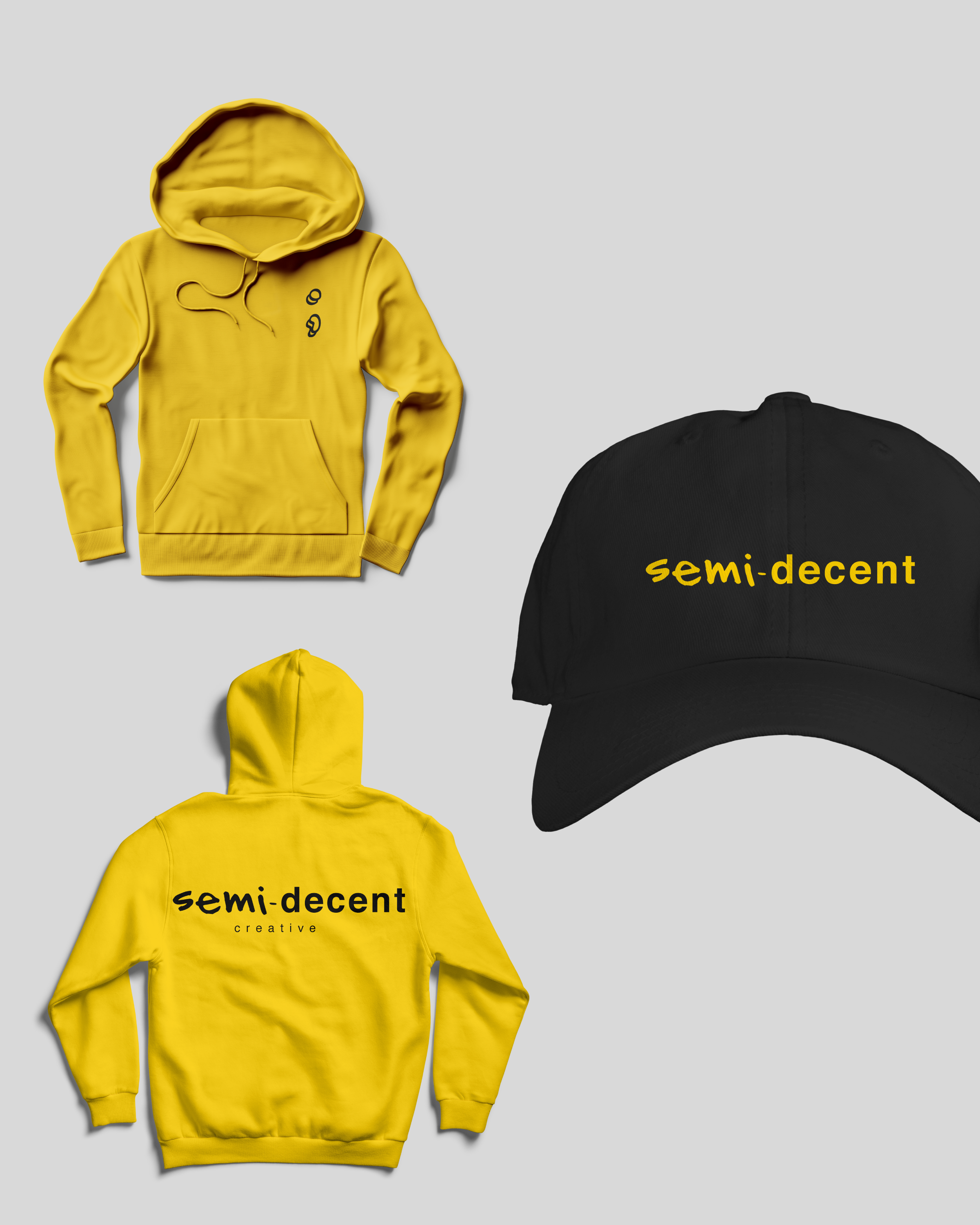
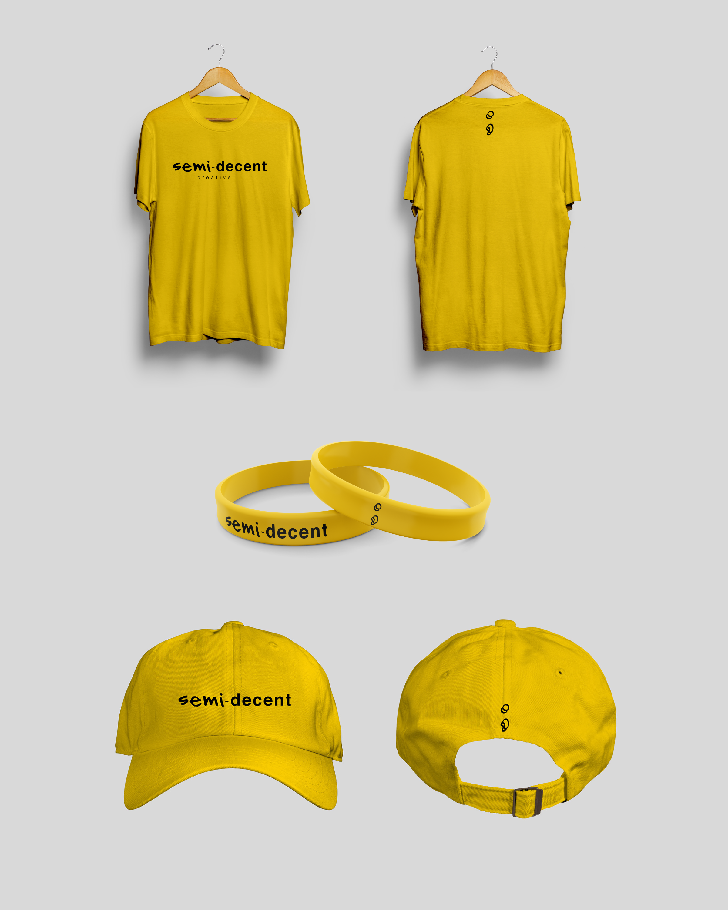
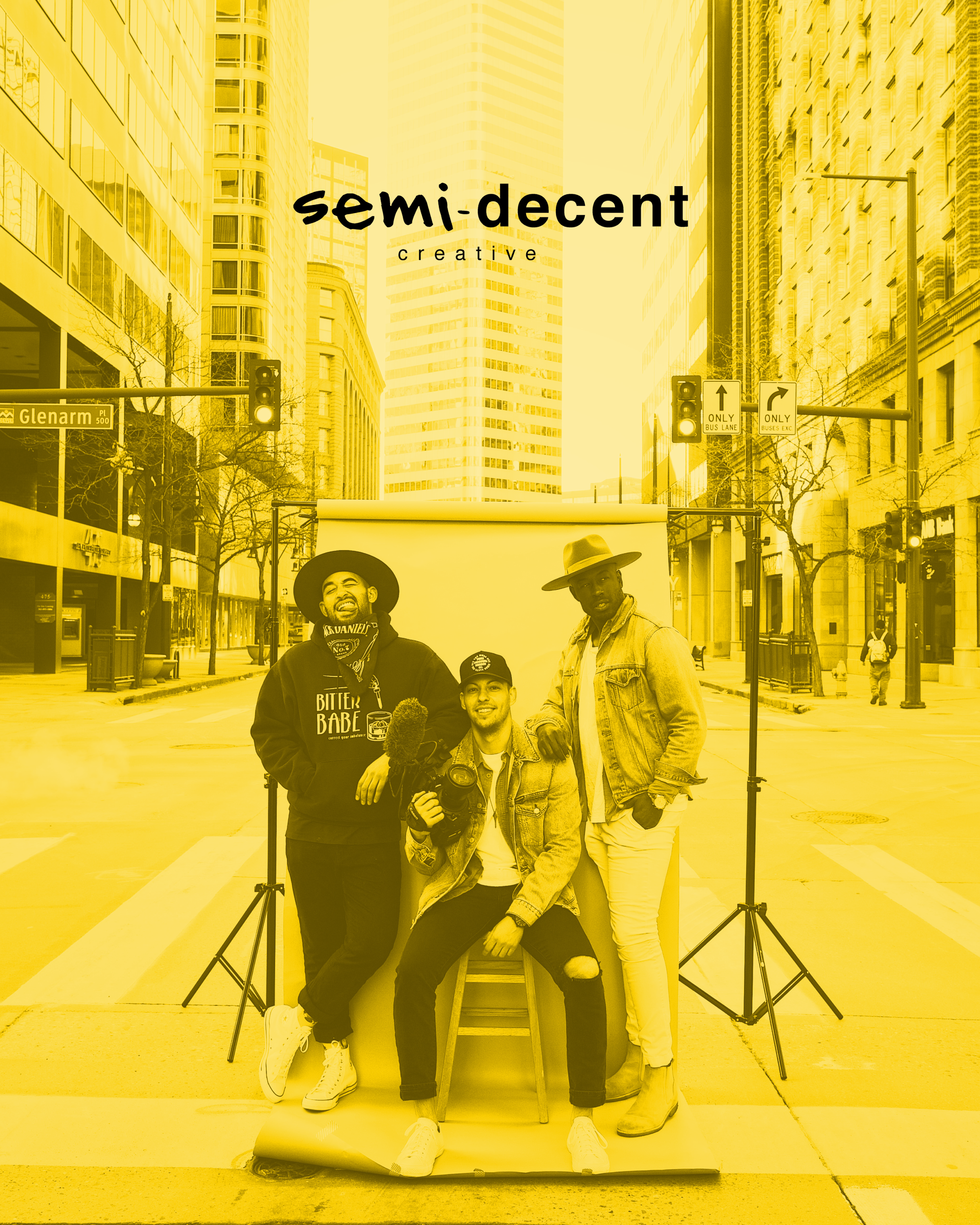
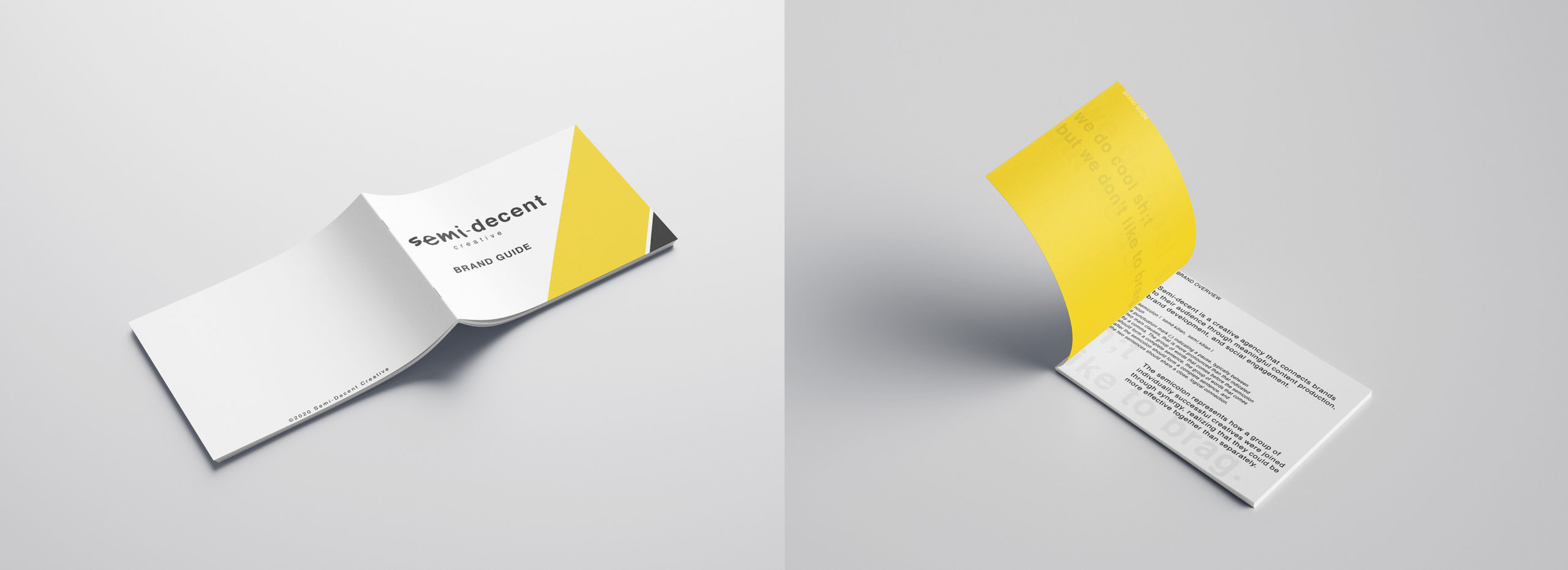
Luxpiration has designed the brand identity, language, and website for Semi-decent Creative a creative agency that connects brands to their audience through meaningful content production, brand development and social media management.
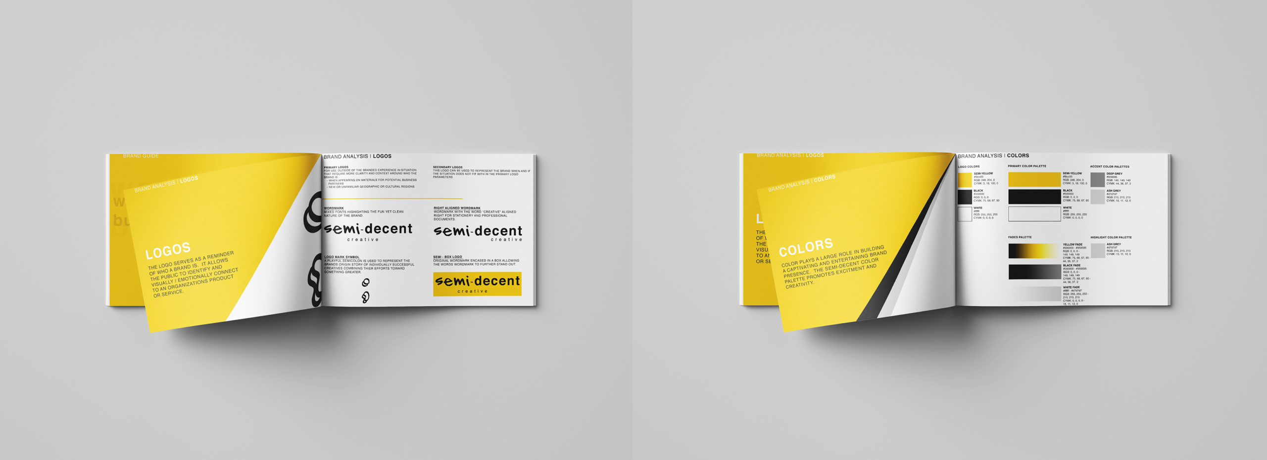
The semicolon represents how a group of individually successful creatives were joined through synergy, realizing that they could be more effective together than separately.
semicolon I ·seme, kO/an, ·semi, kO/an I
noun
a punctuation mark (;) indicating a pause, typically between two main clauses, that is more pronounced than that indicated by a comma. The group of words that comes before the semicolon should form a complete sentence, the group of words that comes after the semicolon should form a complete sentence, and the two sentences should share a close, logical connection.
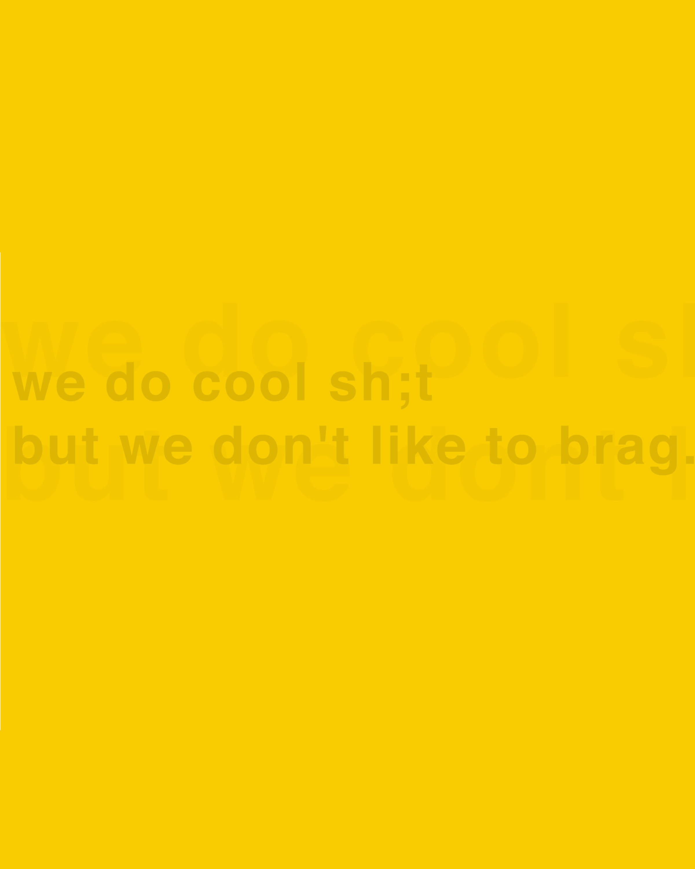
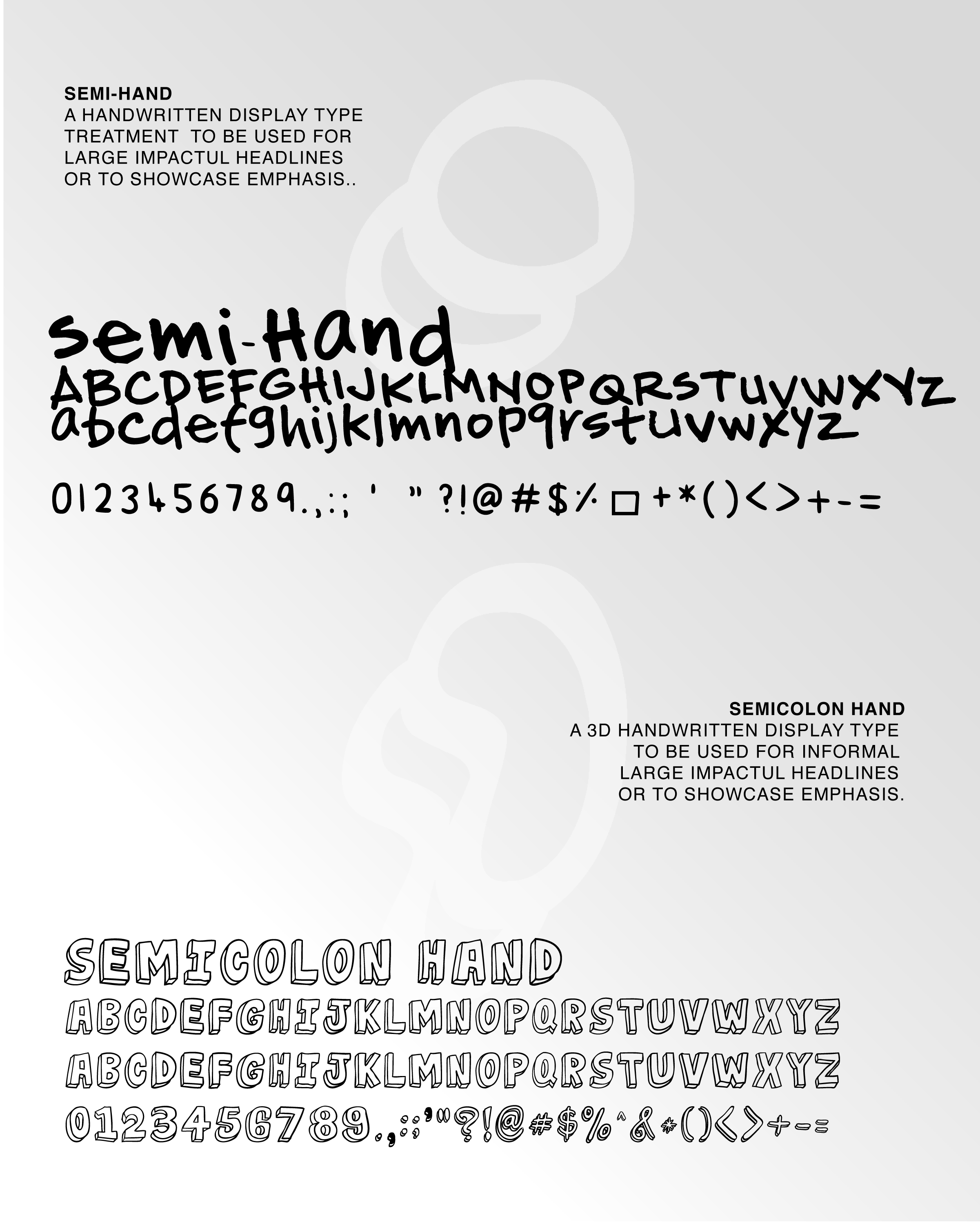
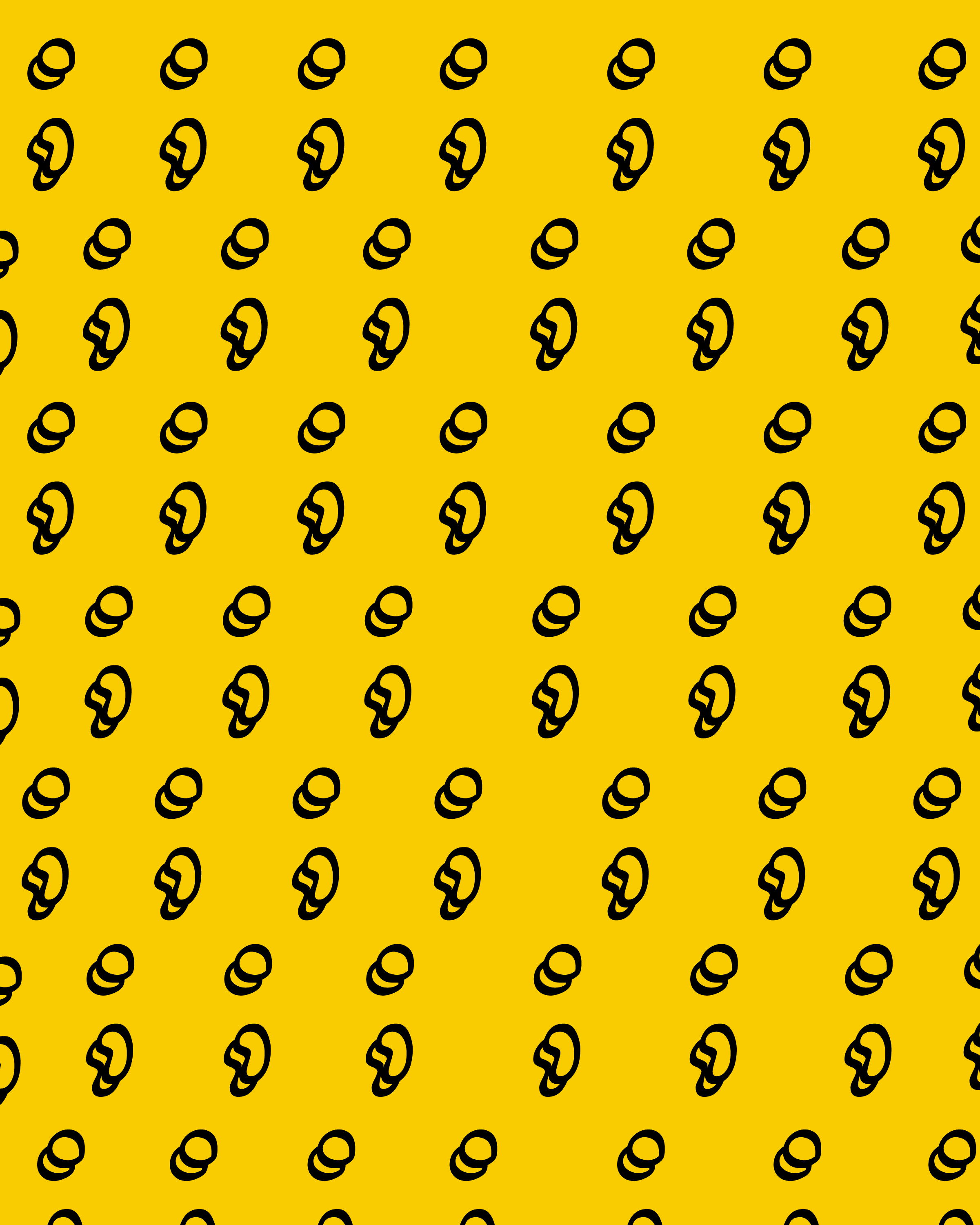
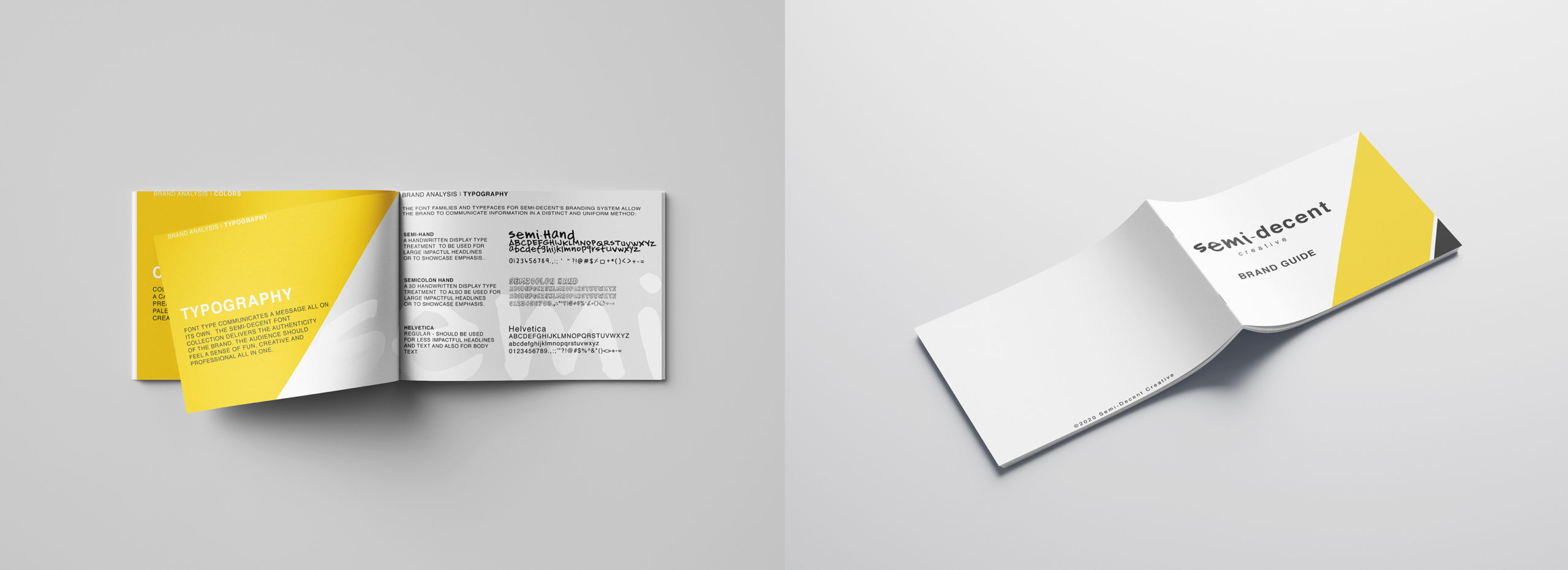
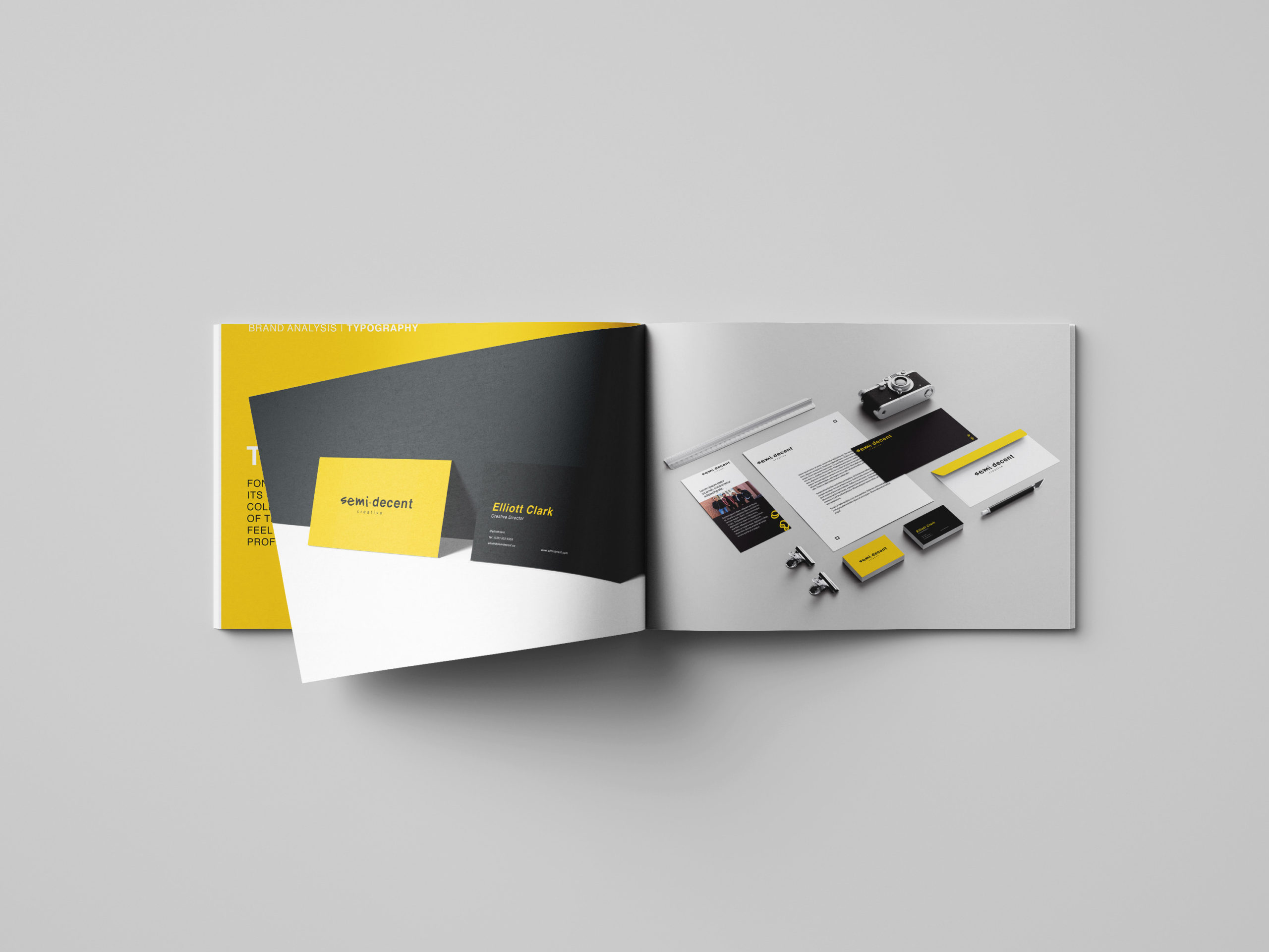
We took a vibrant approach utilizing yellow as a main color and a hand drawn typography to highlight the agency’s fun and creative nature. The black and white minimalist accents speak to the trustworthiness and clean-cut aesthetic the founders wanted to portray.